Page 1
Making Patterns
The following are pages from the photo gallery in my notebook for this chapter. On this page the patterns are from nature, apart from the jellyfish all photos were taken by me. I love the irregularity of the woodpecker attached tree trunk and the texture of the bark beneath.
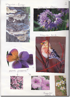
Page 2 – The following are again patterns from nature, irregular patterns. I found the amazing fungi in the woods while walking the dog, love the pattern, texture and shape.
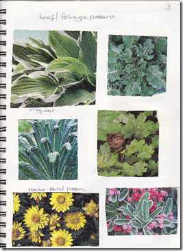
Page 3 – This page is mainly leaf and foliage patterns but the shapes are very interesting too especially the curly kale. This would make an excellent textured piece. The exception, the flowers at the bottom have a regular pattern and shape.
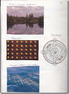
Page 4 – I love the mirror image of the reflection in the water and the colours, I am very drawn to this photo. The mandala is another mirror image. Then we have examples of a regular and an irregular pattern.
Page 5 – A regular pattern with the moth and also with the ferns underneath the moth. Regular with the balloon, and those colours, so bright and cheerful! I had to put the inukshuk in, the Canadian icon and a wonderful irregular shape. Finally the paisley which to me contains elements of regular and irregular patterning.
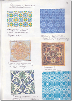
Page 6 – the first of two tile pages, they are great images for showing patterns. Each tile is labeled underneath with my interpretation of the type of repeating pattern that they show.
Top left is a staggered repeat and rotational symmetry. Top right is sliding and rotational symmetry. Middle left is rotational symmetry and a mirror image. MIddle right is the same. Bottom left is partly mirror image and bottom right is mirror image and sliding symmetry.
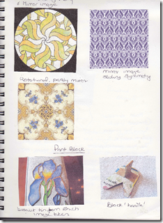
Page 7 – more tiles!
Top left rotational and mirror. Top right mirror image and sliding symmetry. Middle left is rotational and partly mirror image.
At the bottom of the page is the image I used to make my print block, an iris on a biscuit tin. I thought the petals would ‘explode’ nicely and they were all irregular in shape. The photo on the right is the made up block showing the handle.
Page 8
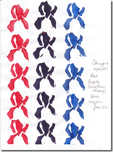
Here are my drawings of the iris, then the exploded image with the photo of the finished block. The first one I made was too big so I traced the pieces again, penciled onto the fun foam then cut well within the lines to make it smaller. The two small pieces in the middle basically disappeared when cut down so they were left out. The block is still quite big but I found it really difficult to size down any more. The pieces were then reversed and glued onto heavy card and the handle made behind.
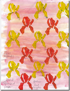
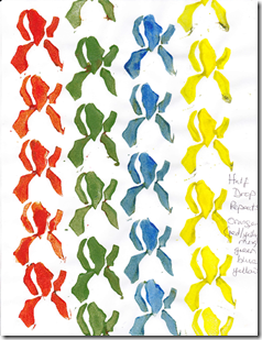
The page next to this is the straight pattern repeats using this block, red, purple and blue acryllic paints. Below on the left are the spot repeats using red and yellow paint on sponge washed paper. On the right are the half drop repeats using orange (mixed yellow and red), green, blue and yellow acryllic paints.
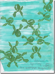
Below is the rotational image made with this block on hand sponged paper. I tried this a couple of ways, with the top of the iris pointing out and then the top pointing in. I think I prefer the latter but it is not an easy block to use in this way
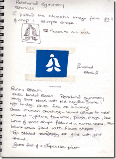
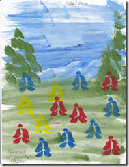
Page 9 – This page shows the image I chose from Chapter 1 of the clematis flower to use as the stencil. The shape is simple and lends itself to rotational symmetry, I redrew the image as a stencil cutout, and then coloured the areas to be removed. Below is the actual stencil itself. The next page is the mirror image using this stencil done in red and blue paints, this stencil shape is much easier to use than the iris and could be rotated much more easily.
The following page was just for fun as an experiment, I sponge painted the background for an alpine scene and then spot stenciled in different colours, although it’s a flower stencil in this setting the pattern could almost be primitive people having a stroll……..
Page 9 – Print and Stitch
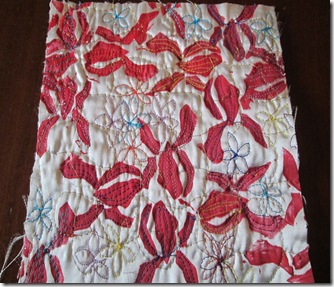
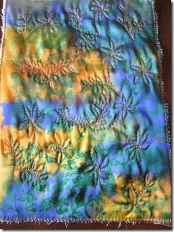
Rotational symmetry using my handmade print block. I used white bridal satin with red acryllic paint on the block. I used the top in version of the rotation. It was left to dry then backed with white felt. Free motion stitching with varied colours – yellow, orange, turquoise, purple and blue. I used lines to follow the petal shapes of the print and then filled in the empty unprinted areas with flower shapes. I then top stitched a wavy grid across and up and down in gold thread. Once it was finished it had a very Japanese print feel to it and I like the effect.
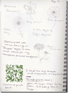
Page 10 – The final piece was to be printed with transfer paints and then stitched in the style of Cefyn Burgess. When I did my first exercises in Chapter 1 there was very little growing so now I went out to the garden and did some drawings of flowers from life to expand my images a bit. I hope that you can see the penciled drawings. I wanted to see what would fit my background.
I had decided to use a commercial print block, image printed at bottom of page above. I really liked this curving leaf pattern and felt that it was a ‘Burgess’ type pattern.
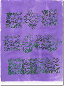
I experimented with printed it on a colour washed background, I turned the block at various angles to see which I liked best but decided the straight repeat was best. I decided I didn’t like the straight purple background so used a variety of colours in my transfer painted paper.
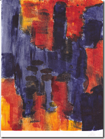
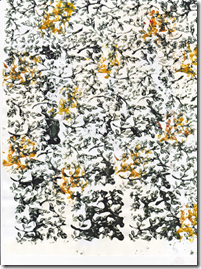
It’s always so hard to figure out how a transfer painted piece of paper will look when ironed onto the fabric. I used green underneath and painted first to see how it would turn out. Then I filled in with some yellow and orange and then two shades of blue as a type of lattice over the centre of the page. The second piece of paper was printed with mainly green transfer paint on the print block, some yellow images were made but showed very little in the final piece.
I should have taken a photo of the finished fabric before stitching but forgot….mea culpa!
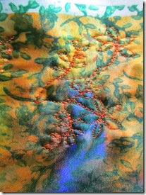
Page 11 – the final piece was white bridal satin, first the background transfer painted paper was ironed on and then the block printed sheet over the top. I really like the colours that were produced, the soft oranges and blues and the green of the block showed up quite nicely on the background, I was concerned that this wouldn’t be the case. Some of the leaves came out very clearly, others more blurred possibly I had applied the paint too thickly or the fabric shifted slightly under the iron. I decided after looking at the fabric that most of the flowers I had drawn in my notebook were a bit fussy and too elaborate for the background so I went with a small daisy type flower with curving stems and small leaves that picked up the leaves in the stamped images. I backed the piece with white felt and originally chose an orange thread that I thought would complement the background. However after stitching a bit I found that the orange just wasn’t quite right, was too bright and intrusive – see below
I then chose a pale orange rayon thread to echo the sheen of the fabric and stitched with that, the result blends in far better, I wanted the effect of the stitching to be subtle.
I also left some area of the leaf block printing clear of stitching so that the stitching could echo the print.
Working with pattern has been interesting, it has taught me to look more closely at patterns in everyday life, some are very obvious and some are far more subtle. Patterning can be flat and 2D but it can also be part of the texture of something like tree bark. Stitching can convey both 2D and 3D effects, it can be used to suggest texture and form, it can be the main focus of a piece or a border or just be a small part of a finished item. It can be vivid as in the paisley pattern photo or it can be very quiet, it can be formed by many different colours or it can be just formed by one colour.
Lots of basis for experimentation!


